So isn’t that backwards from a pro-USA direction. Hasn’t it been going in the other direction for quite a few months now? Maybe that was like a stretching rubberband that had to snap at some point. A few more months will tell us whether the previous points were data blips, or this one is.
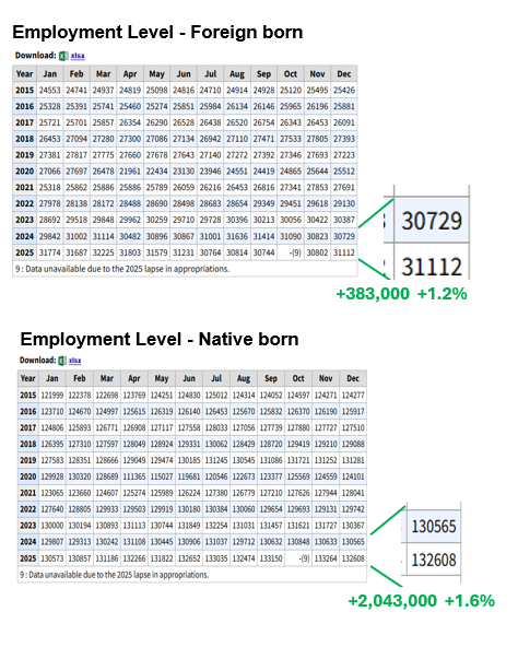
It doesn’t matter really. It shows that @Gaius was right that illegals were in fact being counted and constituted a lot of the growth during the Biden admin
Probably.
That is from the “A tables” which is compiled via household survey.
BLS simply calls a bunch of people asks them “Are you working?” “Where were you born?”
etc.
Best guess? (seriously) They wanted to ask “Are yoy legal?” but figured they wouldn’t get trustworthy answers.
.
.
.
The ‘science’ behind it is the same as with every gov’t survey.
People lie, but the % of people who lie does not change sharply from month to month.
THAT mismatch is not as uncommon as we might think.
It happens a lot.
The answer lies in this
Two methods, two sets of questions.
Every month (regardless of who is president, what party, etc.)
The widely reported “topline” number comes from “The establishment survey.” (BLS surveys a bunch of employers, they report how many people are working for them.)
That number never quite matches anything on “The Household survey” and never quite matches any subcategory of it (such as the A-7 table that I track here every month.)
Yes.
One survey shows +50k, the other shows -340k.
That is a big difference.
The gov’t does a lot of “double” surveys, using two methods and
(GDP, CPI etc)
In the era of landlines, the two always matched pretty well.
as cell phones became more popular, the data deteriorated
in the post-COVID era the two often show differences large enough to raise eyebrows.
This trend exists not just with employment data but with other data such as GDP.
The conspiracy theory wing of MAGA (YAAARGH revisions!! Oooh Jekyll Island) are what you probably think, but there is a quantity of truth behind their assertions
Well . . . we are surveyng the subset of people who respond to phone spam so . . ..
EX1:
GDP is measured two ways. What people spend should equal what other people make. The two methods have never quite matched but fist wiht the cell phone era and then sharply post-COVID they don;t match nearly as well a sthey used to.
EX2:
For CPI purposes home prices (one-third of the CPI).
We survey people who do not avoid spam calls ask them if they are homeowners. If they answer “Yes” we ask them “What do you think your home would rent for?”
→ Seriously, it is THAT unscientific.
Homeowners have not been in the rental market for many years and are notoriously AWFUL at answering that question, but
The ‘science’ behind it is that, over time, the degree of mistakes is unlikely to change much, so we go with what we’ve got.